| Document number | Revision |
|---|---|
| DOCU12458 | 1 |
Configuring the side navigation menu
Configuring the side navigation menuBackgroundIntroductionConfigurationElementsStatic titlesSectionsAttributesStatic sectionsDynamic sectionsUse existing default dynamic sectionsModify an existing dynamic sectionsCreate a new dynamic sectionsLinksAttributesLine separationsIconsBundled IconsCustom IconsParameters
Background
In this article, you will be introduced to the configuration of the side navigation menu in Highstage.
Introduction
The side navigation menu in Highstage is used to gain access to the various features of Highstage:
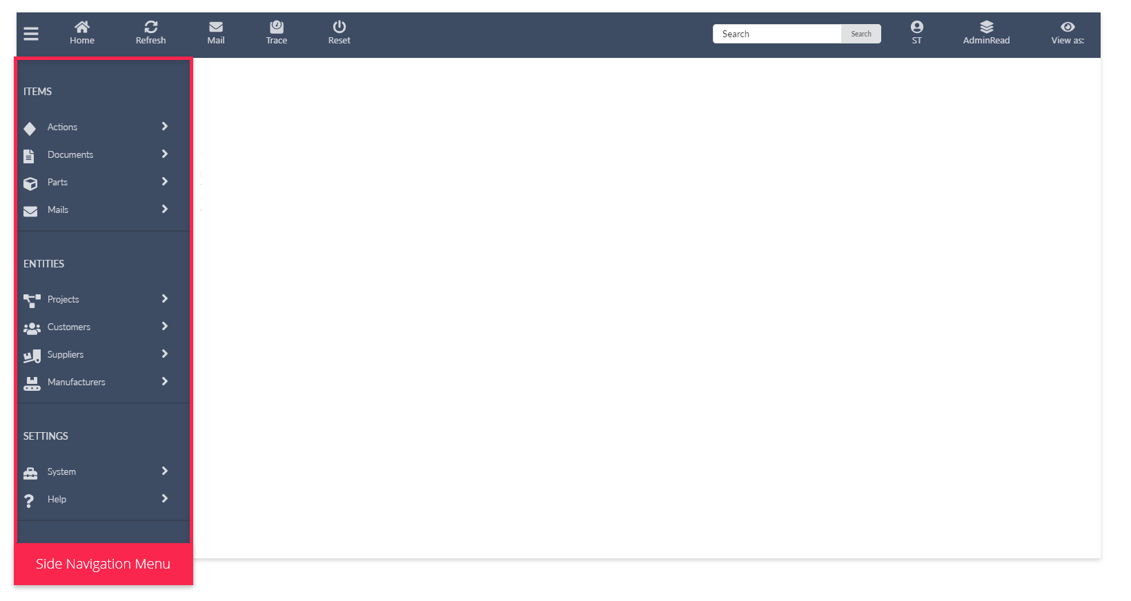
It is from this menu that all contents in Highstage can be accessed. Similarly, the content of the side navigation menu is highly customizable to support the requirements and needs of your company or organization.
The supported and configurable side navigation menu elements includes:
Similarly, we have added a number of Parameters to control the capabilities of the side navigation menu including:
- Whether Icons are hidden or displayed in the menu.
- Default icons for Sections and Links.
- Whether only one single Section can be expanded at a time.
Configuration
You can customize your side navigation menu in the custom.schema.xml located in the tweak folder of your Highstage installation.
Customize the existing side navigation menu
To make modifications to the existing menu, add the following snippet to your custom.schema.xml:
<type name="ts_menu"> <menu name="default"> <!-- Content goes here --> </menu></type>Changes to this menu will be merged with the existing default menu.
Create a new side navigation menu
If you want to create an entirely new side navigation menu, you can add a _overwrite="1" attribute to the <type> element. This will overwrite the existing side navigation menu, allowing you to build the menu yourself:
xxxxxxxxxx<type name="ts_menu" _overwrite="1"> <menu name="default"> <!-- Content goes here --> </menu></type>All the various Elements that is placed within the <menu> element will be displayed in the menu.
Notice: Remember to Reset Highstage whenever you make changes to the
custom.schema.xml.
Elements
Here you can find the available elements to be used in the side navigation menu.
Static titles
A static title is a <title> element which can be used as a short descriptive text to provide some context to a group of Sections and Links:
A static title can be added to the menu, using the following snippet:
xxxxxxxxxx<title name="id" title="TITLE TEXT HERE" />Tip: Remember that the
namemust be unique. If several elements has the same name, they will be merged.
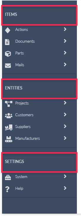
Sections
A Section is a <Section> element that can be used to group content. These sections are used as drop down items in the menu. Sections does not navigate the user to any Highstage features, but serves solely as drop-down containers:
You can create your own drop down menu with any number of underlying items. We define these sections as Static sections.
You can also create, or use Highstage default sections, that is specifically created for each Basetype in Highstage. We refer to these sections as Dynamic sections. A dynamic section, is a section that is loaded from an existing Basetype. This means, that we simply refer to an existing menu, and place it into the current menu as a section.
Attributes
The following attributes are available to be used in <section> elements:
| attribute | Description | Samples | Required | Note |
|---|---|---|---|---|
name | Mandatory and unique ID | name="ID" | ✔️ | Each <section> must have an unique ID in the name attribute. |
title | Text to be displayed in the section. | title="Documents" | ❌ | Will display name if not defined. |
icon | Icon to be displayed in the section. | icon="fas fa-user" | ❌ | Default icons are displayed if not defined. Learn more about the available icons. |
customicon | Custom Icon to be displayed in the section. | customicon="/tweak/icon.svg" | ❌ | Lean more about custom icons. |
size | Configure the size of the section. | Small: size="small"Medium: size="medium"Large: size="large" | ❌ | Will use medium if not defined. |
expanded | Whether the section is expanded by default. | Disabled: expanded="0"Enabled: expanded="1" | ❌ | When a section is expanded, all other sections are disbanded automatically. Will be ignored if the SidemenuExclusive parameter is enabled. |
description | Displays a short descriptive text under the title | description="Lorem Ipsum" | ❌ | Only available for sections in large. |
trustees | List of vector roles allowed to see the section. | trustees="Everyone" | ❌ | Defaults to Everyone if not defined. |
type | Adds an existing menu from another Basetype to this section (Dynamic section). | type="doc" | ❌ | Read more about Dynamic sections. |
Static sections
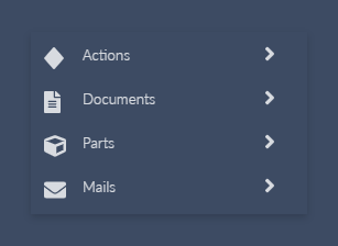
A static section is a regular expandable section. These sections can contain any number of elements, to be displayed when it is expanded.
A basic section can be added to the menu, using the following snippet:
xxxxxxxxxx<section name="ID" title="Section"> <!--Menu items goes here--></section>The result:

Dynamic sections
A Dynamic section is a section that takes advantage of an existing menu from another Basetype (Documents, Actions, Parts, Devices etc.). You add it to your side navigation menu by referring to it using the type attribute in your Section element. In this manner, the content of the Section is defined in the schema associated with the type that you are referring to.
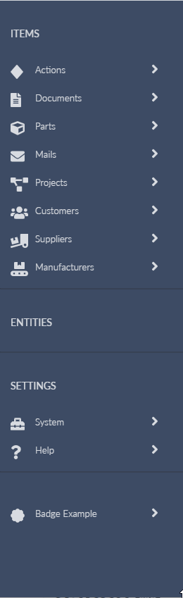
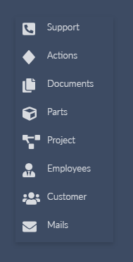
The following sample gives you an overview of some of the Dynamic Sections that are available in Highstage (We added Icons to make it look nice):
xxxxxxxxxx<section name="action" type="action" icon="fas fa-diamond" /><section name="doc" type="doc" icon="fas fa-file-alt" /><section name="part" type="part" icon="fas fa-cube" /><section name="mail" type="ts_mail" icon="fas fa-envelope" /><section name="Projects" title="Projects" type="project" icon="fas fa-project-diagram" /><section name="Customers" title="Customers" type="customer" icon="fas fa-users" /><section name="Suppliers" title="Suppliers" type="supplier" icon="fas fa-truck-loading" /><section name="manufacturer" title="Manufacturers" type="Manufacturer" icon="fas fa-conveyor-belt" />Notice: Notice that we do not define the contents of these Sections, as the contents are defined elsewhere. We simply refer to it using the
typeattribute.
This gives you the following result:
Use existing default dynamic sections
By default, Highstage provides a number of sections that is loaded from existing basetypes with a number of predefined sections and links to support the basic features in relation to those basetypes.
These dynamic sections can be added to your menu, using any of the pre-defined dynamic sections from the following snippet. A sample is shown below:
xxxxxxxxxx<section name="action" type="action" /><section name="doc" type="doc" /><section name="part" type="part" /><section name="project" type="project" /><section name="ts_user" type="ts_user" /><section name="ts_user2" type="ts_mail" /><section name="ts_system" type="ts_system" />
Modify an existing dynamic sections
You can customize any of the existing dynamic sections by declaring the <menu> element and appropriate menu content within the associated basetype <type>.
For instance, the following snippet modifies the existing Document dynamic section, and adds a new menu section to it:
xxxxxxxxxx<type name="doc"> <menu name="default"> <section name="CustomSection" title="A NEW DROP DOWN MENU" /> </menu></type>
Create a new dynamic sections
You can create new dynamic sections for any basetype in Highstage. To do so, create a <menu> inside the <type> element of the appropriate basetype.
As an example the following snippet creates a new menu associated with the basetype product:
xxxxxxxxxx<type name="product"> <menu name="default" title="@[type:titles]" expanded="0"> <link name="new" title="New" url="ts/new.aspx?t=product" /> </menu></type>
To use this dynamic section in your menu, simply add it as a <section> in your existing menu where you specify type="product":
xxxxxxxxxx<type name="ts_menu"> <menu name="default"> <section name="ProductSection" type="product" /> </menu></type>
Links
A <link> element can be used as a stand-alone menu item as they add a hyperlink (URL) that the user is navigated to when clicked. These links functions as the various menu items that are added to the menu.
Attributes
The following attributes are available to be used in <link> elements:
| attribute | Description | Samples | Required | Note |
|---|---|---|---|---|
name | Mandatory and unique ID | name="ID" | ✔️ | Each <link> must have an unique ID in the name attribute. |
url | Defines the URL that the user is navigated to when clicked. | url="/ts/search.aspx?&t=doc | ✔️ | - |
title | Text to be displayed in the link. | title="Documents" | ❌ | Will display name if not defined. |
icon | Icon to be displayed in the link. | icon="fas fa-user" | ❌ | Default icons are displayed if not defined. Learn more about the available icons. |
customicon | Custom Icon to be displayed in the link. | customicon="/tweak/icon.svg" | ❌ | Lean more about custom icons. |
size | Configure the size of the link. | Small: size="small"Medium: size="medium"Large: size="large" | ❌ | Will use medium if not defined. |
description | Displays a short descriptive text under the title | description="Lorem Ipsum" | ❌ | Only available for links in large. |
trustees | List of vector roles allowed to see the link. | trustees="Everyone" | ❌ | Defaults to Everyone if not defined. |
Line separations
A line separation between various menu elements can be added to the menu, using the following snippet:
xxxxxxxxxx<break name="ID"/>Note: Remember that the
namevalue must be unique for each <break> element that is added to the menu.
Icons
Icons are now available to be used in Sections and Links in the side navigation menu, to give more context to the capabilities that each menu item has to offer:
Bundled Icons
We support a plethora of readily available Icons for any occasion as made available by Font Awesome.
- Select any available Solid icon from the list of available icons.
- Click on the selected icon that you want to use.
- Copy the text within the
<i> </i>field:
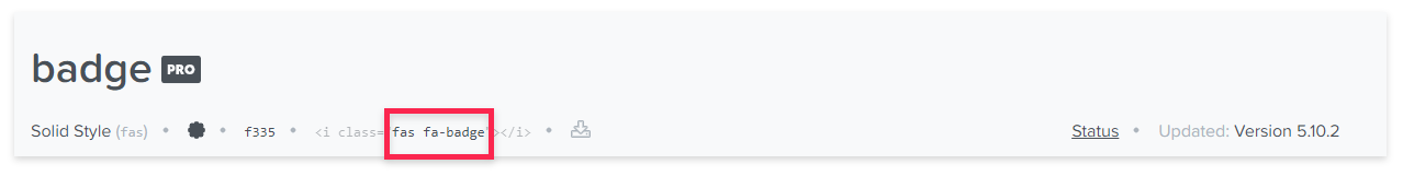
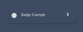
- Paste the text (ex. fas fa-badge) into the appropriate
iconattribute of the Section or Link where you want to use that specific icon:
xxxxxxxxxx<section name="sectionID" title="Badge Example" icon="fas fa-badge" > </section>This will give you the following result in the side navigation menu:
Custom Icons
Sections and Links supports the use of custom icons if the default selection falls short and you want a more personalized look in your Highstage menu.
- Create an icon in a
.SVGor.PNGformat (we recommend a icon size that fits within a 20x20px area with transparent background). - Save the icon in the
tweakfolder in your Highstage installation. - Add the directory of the icon to the
customiconattribute in your Section or Link:
Section:
xxxxxxxxxx<section name="sectionID" title="Custom Icon Example" customicon="/tweak/customicon.svg" > </section>Link:
xxxxxxxxxx<link name="linkID" title="Another Custom Icon Example" customicon="/tweak/customicon.png" url="#" />
Parameters
A number of Parameters has been added to give more control over capabilities of the side navigation menu.
These can be accessed by navigating to SYSTEM > PARAMETERS > UI Parameters in the side navigation menu as an administrator.
The following Parameters can be configured to control specific functionalities of the menu:
| Parameter | Description |
|---|---|
Icons | Enable ( ✔️ ) or disable ( ❌ ) the use of Icons in the side navigation menu. |
SidemenuExclusive | Enable ( ✔️ ) or disable ( ❌ ) whether only one single section can be expanded at a time. |
DefaultItemMenuIcon | A default bundled icon is shown If no icon attribute is defined in a <link> element . |
DefaultSectionMenuIcon | A default bundled icon is shown If no icon attribute is defined in a <section> element . |
SidemenuWidth | Controls the width of the side navigation menu (in pixels). |