| Document number | Revision |
|---|---|
| DOCU12438 | 1 |
Highstage UI Customization
Highstage UI CustomizationBackgroundIntroductionConfigurationAvailable ParametersAccepted parameter valuesColorsIconsSizesTransitionDurationTextToggleWeightShadowDefault UIQuick customizationsChanging the primary color
Background
This article introduces you to the available parameters that allows you to customize the look and feel of Highstage through Highstage UI Configuration.
Introduction
We have made it simple to alter the appearance of Highstage whilst also providing you with many more advanced options to fully customize the look of Highstage to suit your needs. Now, you simply need to define the various colors, sizes, icons and effects as parameter values directly in Highstage, to change the appearance of Highstage.
Configuration
To configure the appearance of Highstage, do the following:
- Ensure that you have administrator privileges' and a set user level of AdminWrite.
- Navigate to SYSTEM > Parameters and select UI Parameters in the side navigation menu.
From here, the various parameters are available:
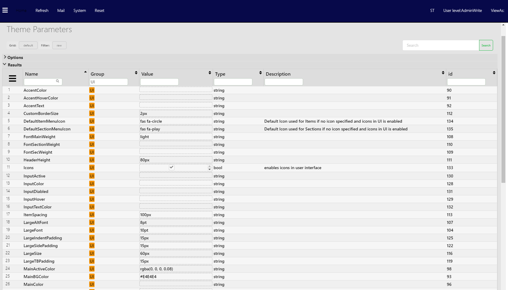
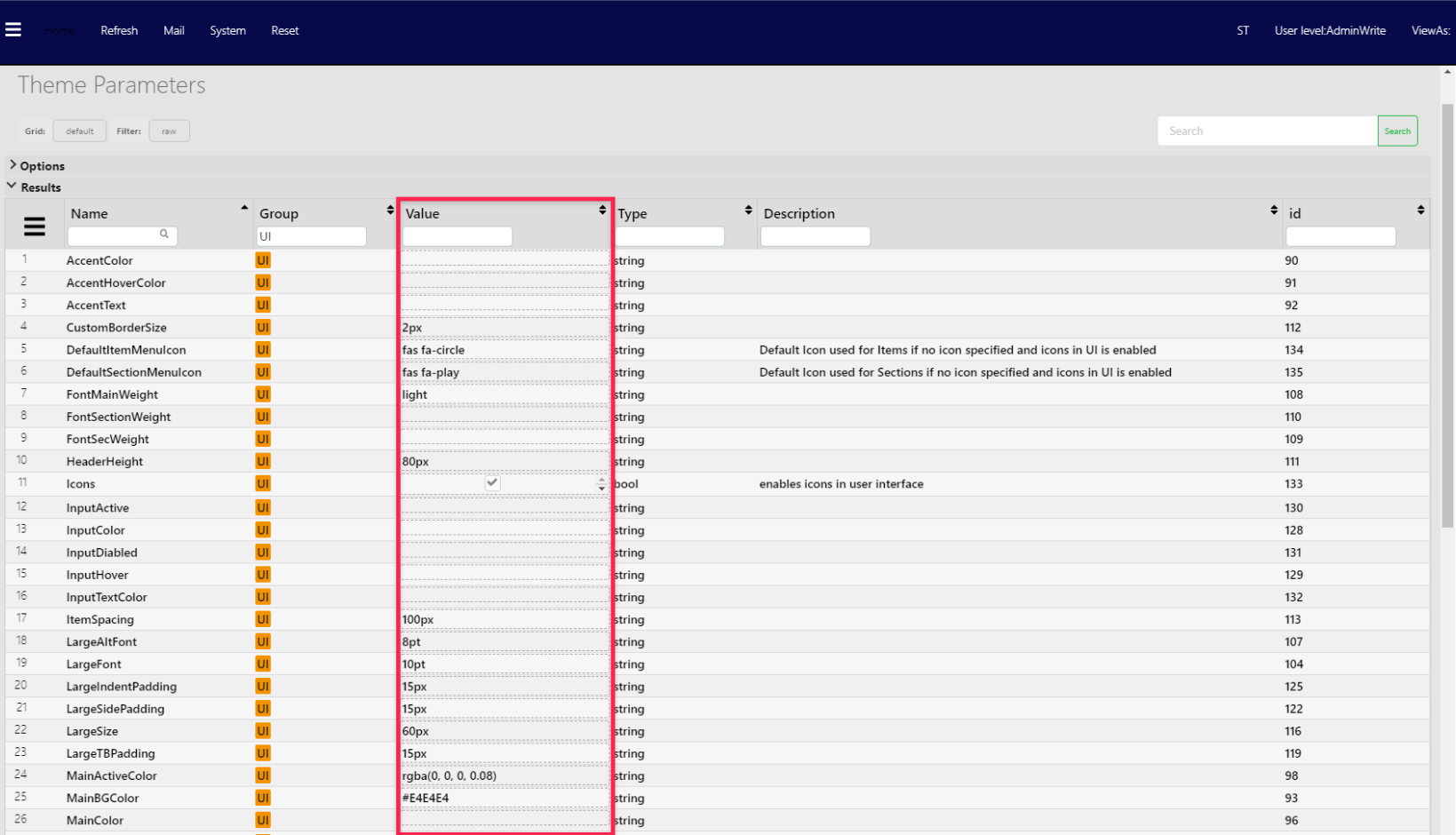
- Update the Value field of any number of available parameters:
- Click Reset in the top navigation menu for the changes to take effect.
Notice: When clicking Reset, you are automatically demoted to AdminRead. To make further changes, please upgrade your user level to AdminWrite.
Available Parameters
Descriptive list of available Highstage UI parameters:
Info: For more information of the accepted values for each parameter, please refer to the Accepted parameter values.
| Parameter | Description | Type | Illustration | Default |
|---|---|---|---|---|
AccentColor | Accent color used for menu separations and loading icon. | Color |  | rgba(255, 255, 255, 0.2) |
CustomBorderSize | Height of menu separations and header accent line. | Size |  | 2px |
DefaultItemMenuIcon | Default icon to be used for links in the side navigation menu. | Icon | 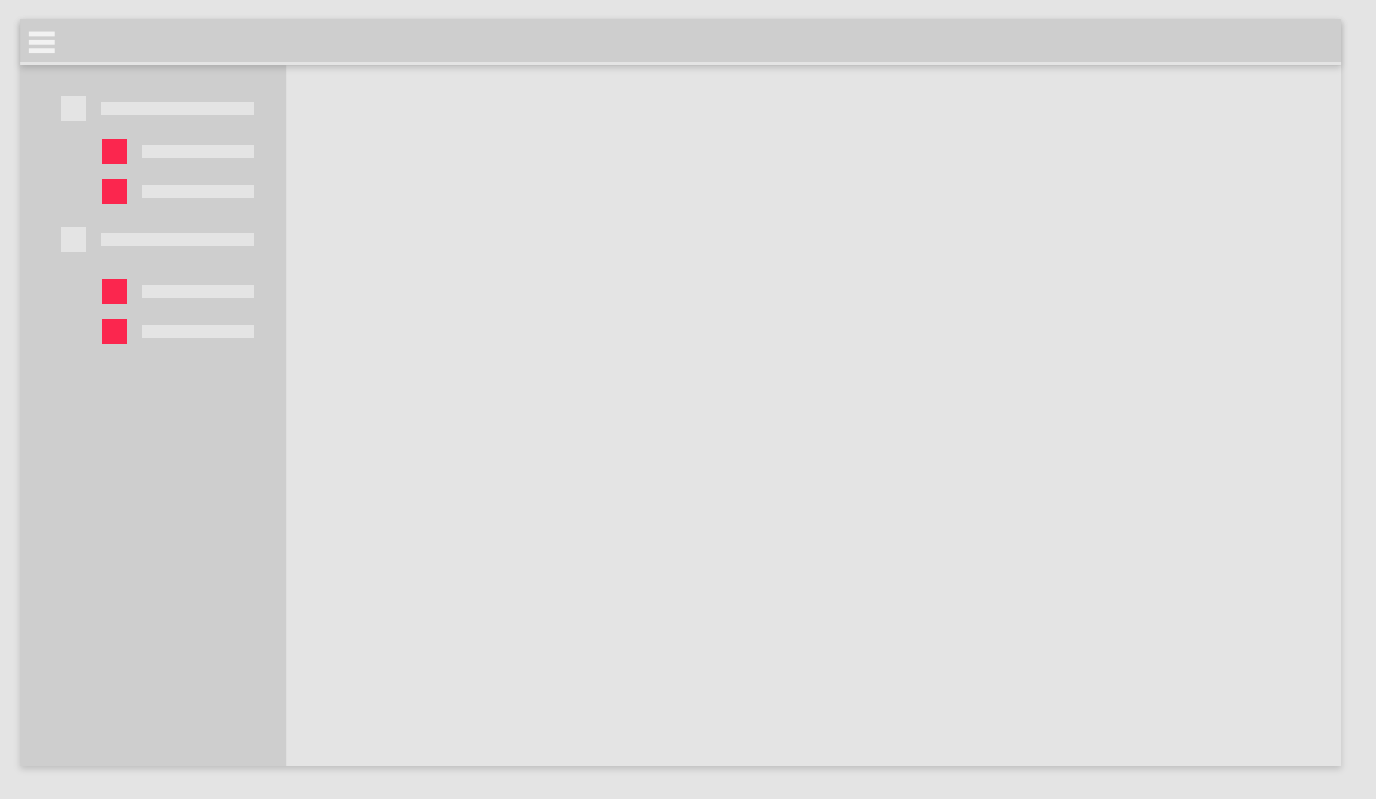 | |
DefaultSectionMenuIcon | Default icon to be used for sections in the side navigation menu. | Icon | 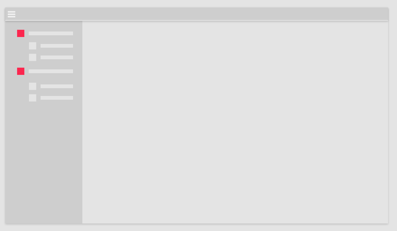 | |
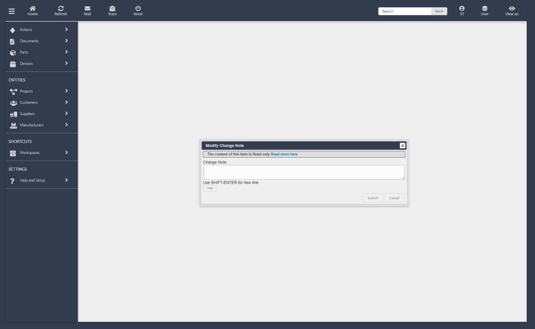
DialogBGColor | Background color of dialogue windows. | Color | 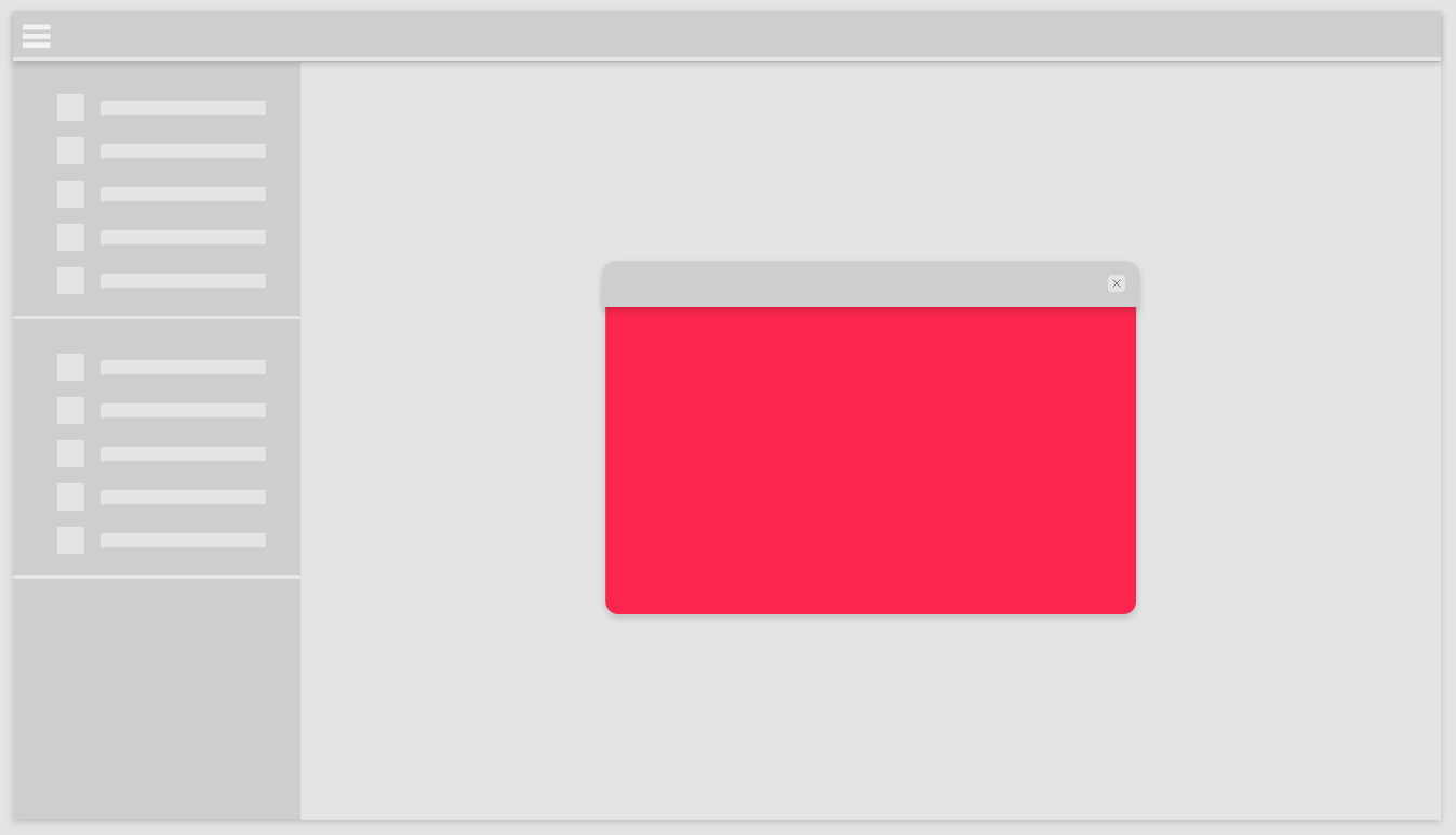 | rgb(239, 239, 239) |
DialogColor | Text color of the heading in dialogue windows. | Color | 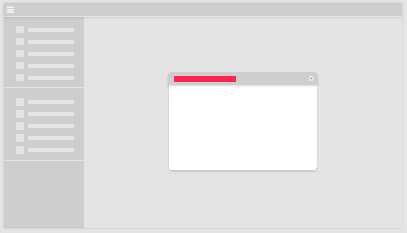 | rgba(248, 248, 248, 0.8) |
DialogHeaderBGColor | Background color of dialogue headers. | Color | 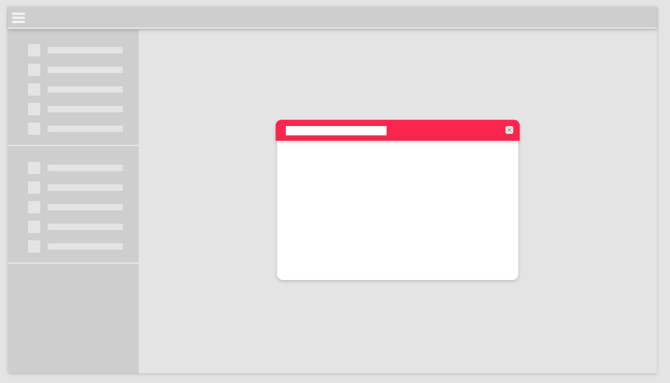 | #333C4D |
FontMainWeight | Weight of text elements in top navigation menu. | Weight | 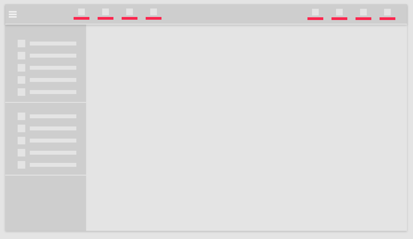 | 400 |
FontSecWeight | Weight of text elements in side navigation menu. | Weight | 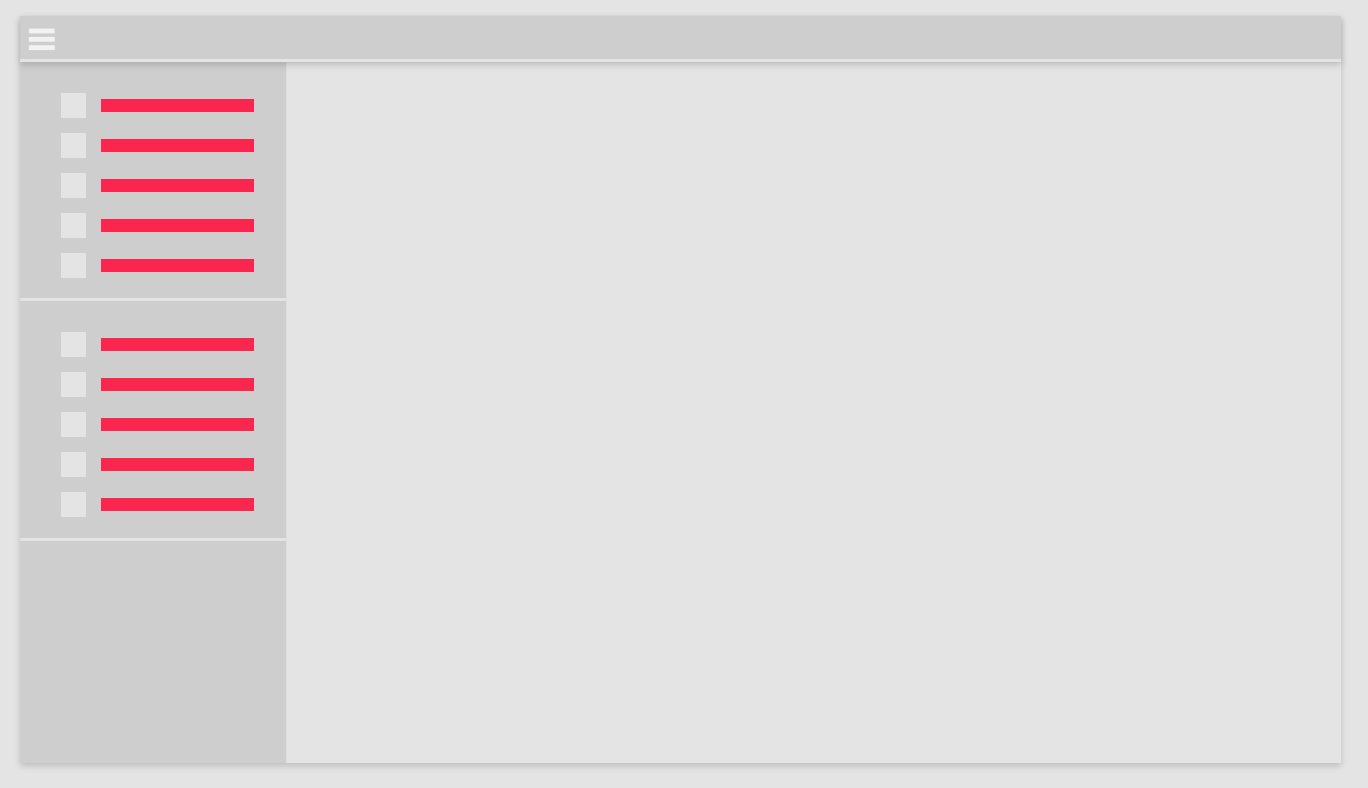 | 300 |
HeaderHeight | Height of top navigation menu. | Size | 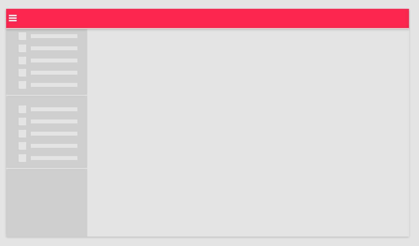 | 70px |
Icons | Enables or disables icons in the side navigation menu. | Toggle |  | Enabled |
ItemSpacing | Spacing between elements in the side navigation menu. | Size |  | 0px |
LargeFont | Text size of large elements in the side navigation menu. | Text |  | 10pt |
LargeIndentPadding | Padding distance for large size elements in side navigation menu. | Size |  | 15px |
LargeSidePadding | Padding distance for large text elements in the side navigation menu. | Size | 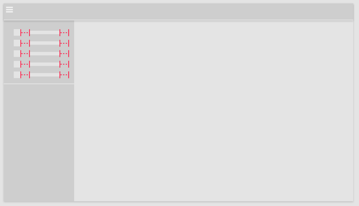 | 15px |
LargeSize | Height of large sized elements in the side navigation menu. | Size | 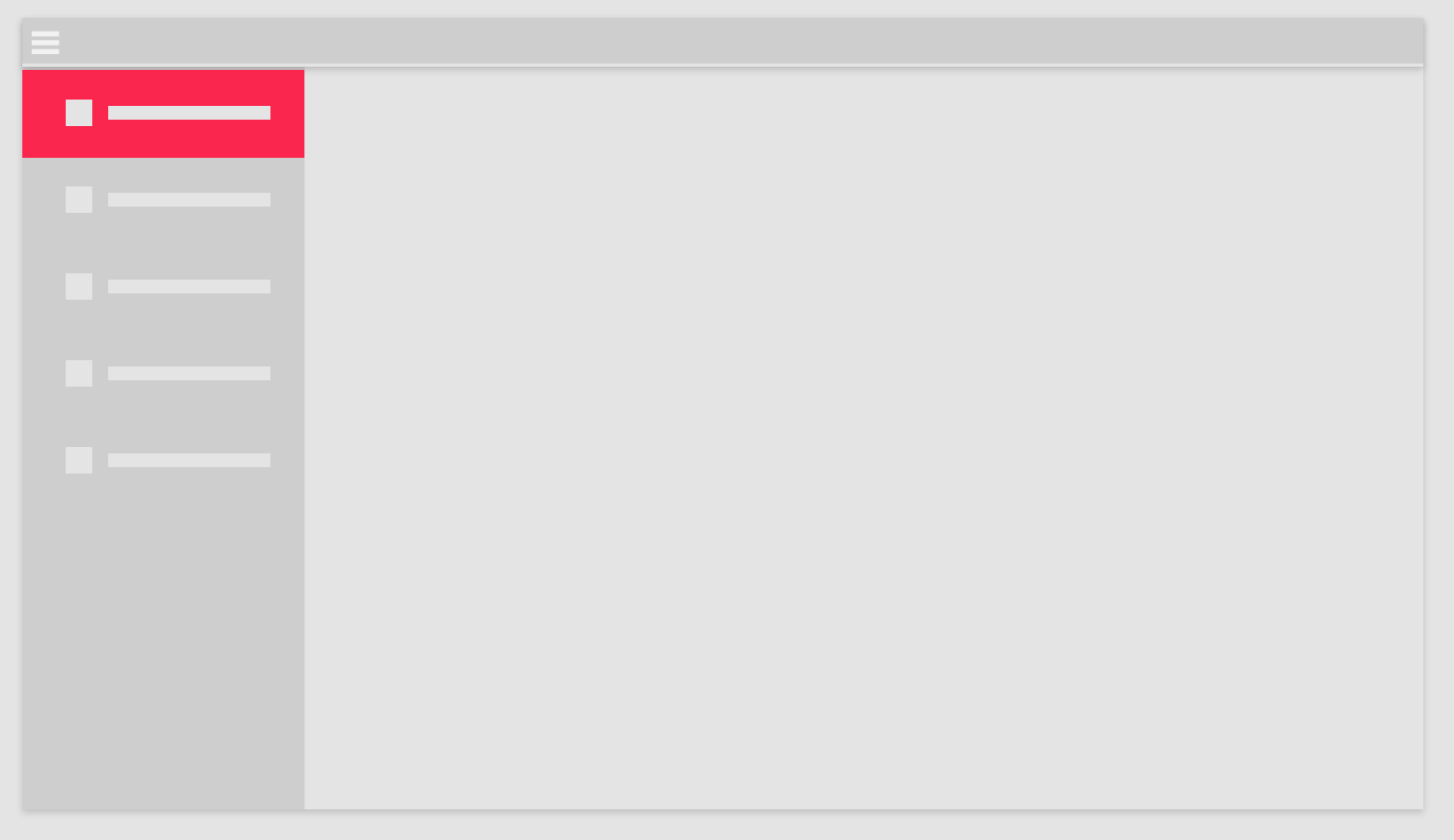 | 60px |
LargeTBPadding | Modifies the top and bottom padding of large menu elements. | Size | (We do not recommend changing this parameter) | 15px |
LinkColor | Color of text links. | Color | 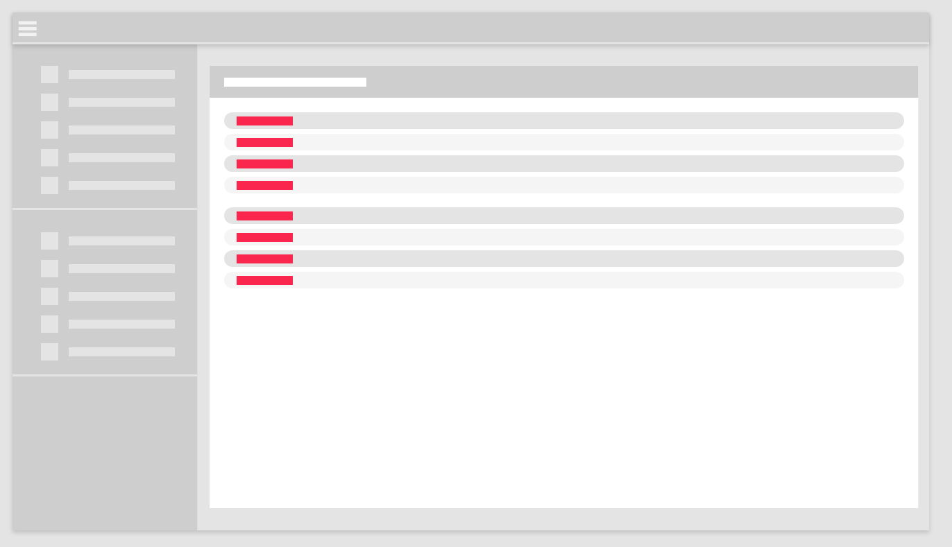 | #006bb6 |
MainActiveColor | Background color for expanded sections in the side navigation menu. | Color |  | rgba(28, 28, 28, 0.3) |
MainBGColor | Primary background color for Highstage content view. | Color | 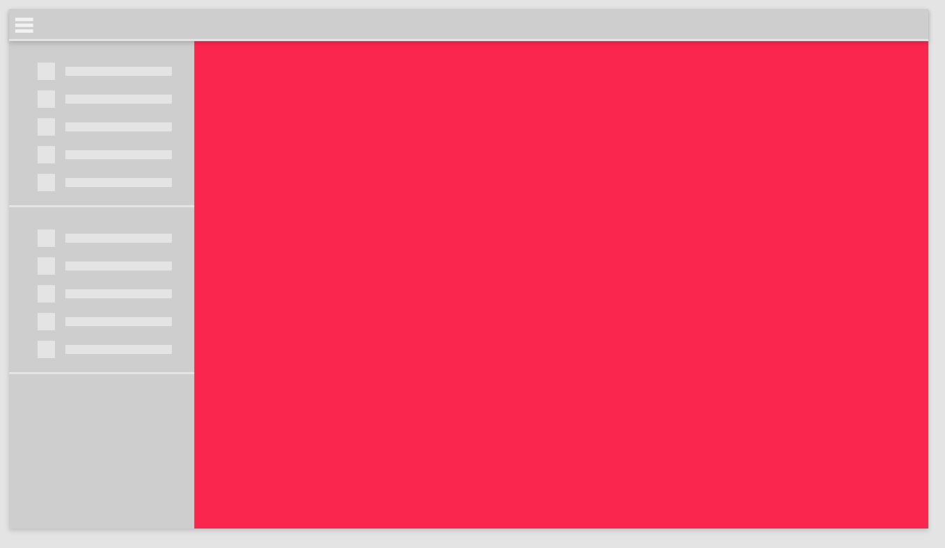 | rgb(239, 239, 239) |
MainColor | Text color in dialogue windows. | Color | 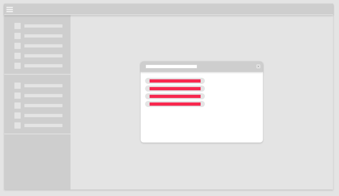 | black |
MainHoverColor | Background color on elements in search pages when hovered over. | Color | 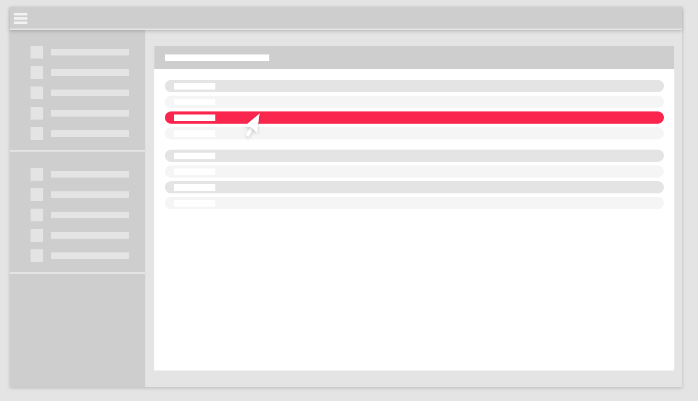 | rgba(28, 28, 28, 0.2) |
MediumFont | Text size of header and medium size menu elements. | Text | 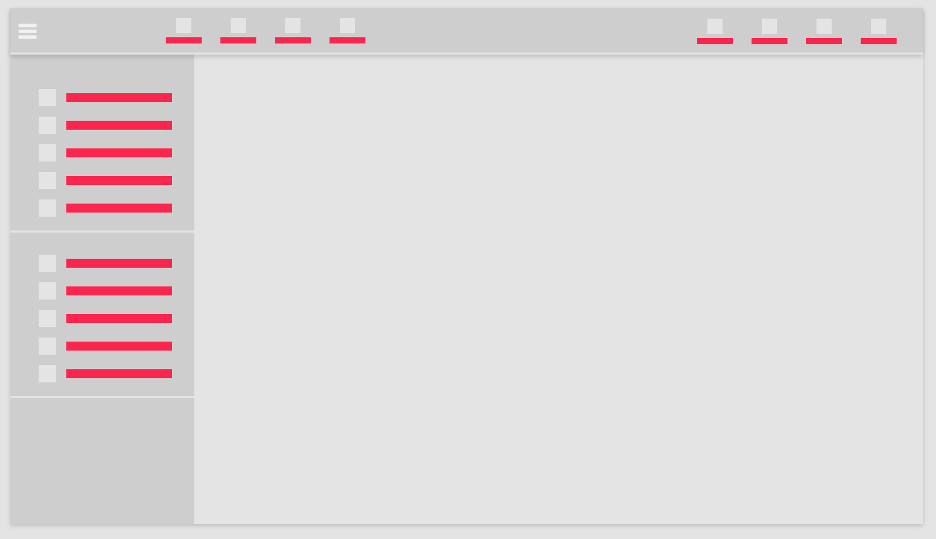 | 10pt |
MediumIndentPadding | Padding distance for medium size elements in side navigation menu. | Size | | 15pt |
MediumSidePadding | Padding distance for text elements in the header and for medium text elements in the side navigation menu. | Size | 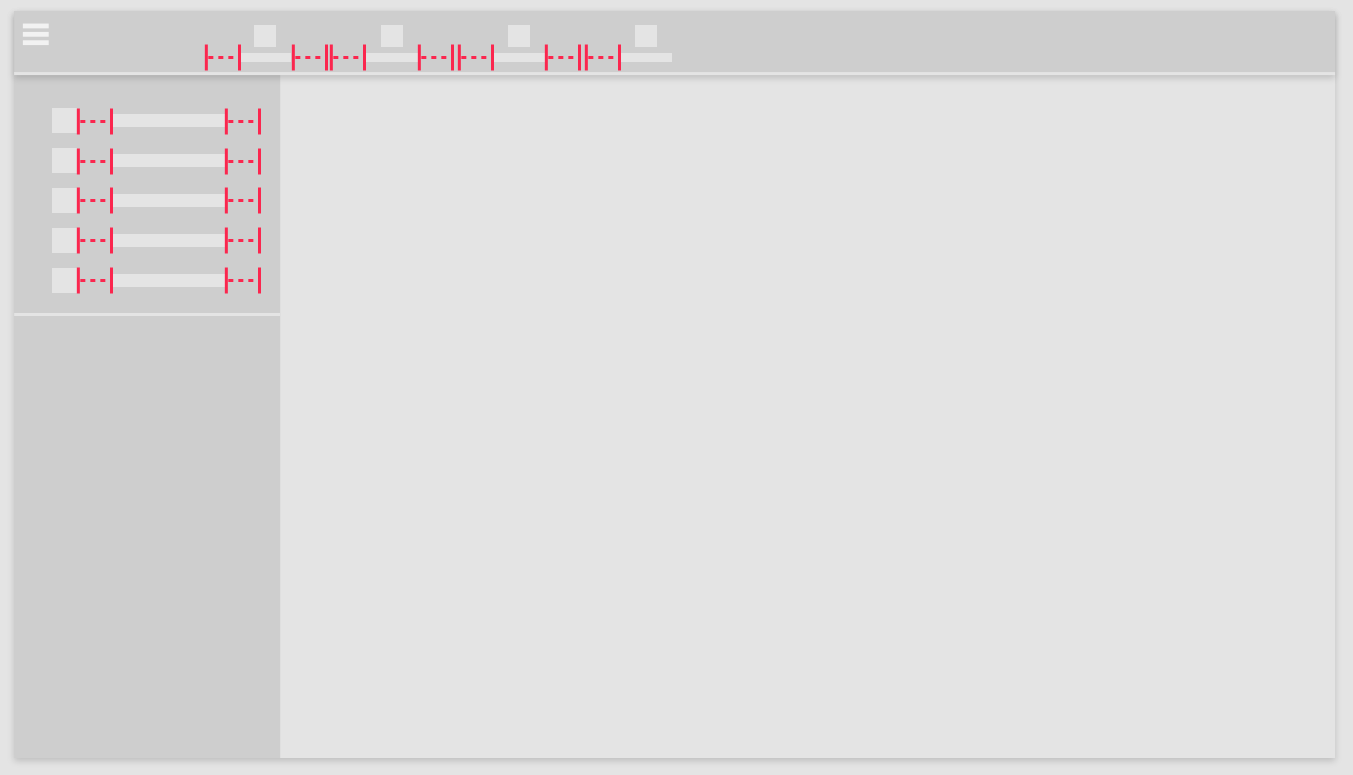 | 15pt |
MediumSize | Height of medium sized elements in the side navigation menu. | Size | | 40px |
MediumTBPadding | Modifies the top and bottom padding of medium menu elements. | Size | (We do not recommend changing this parameter) | 10px |
SecActiveColor | Color of the elements (including icons, text and arrows) within an expanded section in the side navigation menu. | Color |  | rgba(255, 255, 255, 0.8) |
SecColor | Default color of elements (Icons, text and arrows) in the side navigation menu. | Color |  | rgba(255, 255, 255, 0.8) |
SecHoverColor | Color on all elements (text and arrow) when hovered over in the side navigation menu. | Color |  | rgba(255, 255, 255, 0.8) |
Shadow | Shadow of the top and side navigation menu. | Shadow | 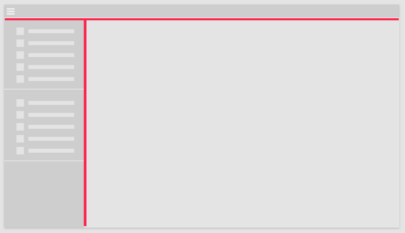 | 0 4px 5px 0 rgba(0,0,0,0.14), 0 1px 10px 0 rgba(0,0,0,0.12), 0 2px 4px -1px rgba(0,0,0,0.3) |
SidemenuBGColor | Default background color of the side navigation menu | Color | 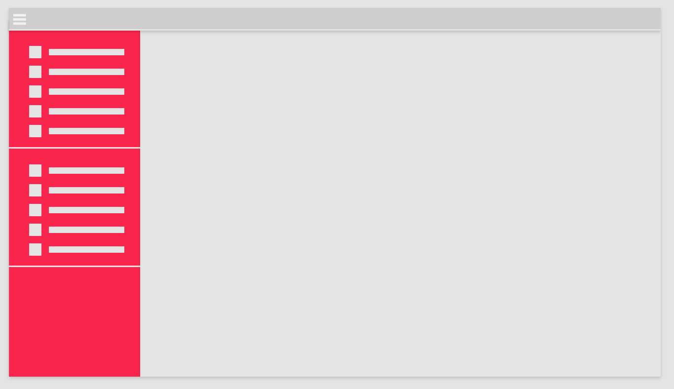 | #333C4D |
SidemenuBGHoverColor | Background color on elements in the side navigation menu when hovered over. | Color | 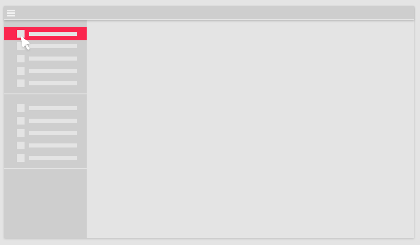 | rgba(28, 28, 28, 0.8) |
SidemenuExclusive | Enable or disable whether only one section can be open at a time. Other sections are automatically closed if enabled. | Toggle | Illustration not available | Disabled |
SmallFont | Text size of small elements in the side navigation menu. | Text | | 8pt |
SmallIndentPadding | Padding distance for small size elements in side navigation menu. | Size | | 15px |
SmallSidePadding | Padding distance for small text elements in the side navigation menu. | Size | | 15px |
SmallSize | Height of small sized elements in the side navigation menu. | Size | | 30px |
SmallTBPadding | Modifies the top and bottom padding of small menu elements. | Size | (We do not recommend changing this parameter) | 9px |
TextColor | Primary text color used throughout Highstage (links are treated separately). | Color | 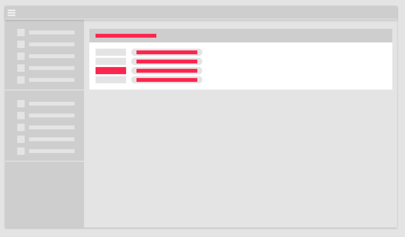 | black |
TopmenuActiveColor | Color of header element (Icon and text) when clicked. | Color | 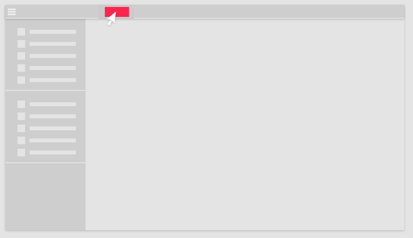 | rgba(255, 255, 255, 0.8) |
TopmenuBGColor | Primary color of the top navigation menu. | Color |  | #333C4D |
TopmenuBGHoverColor | Background color of element in top navigation menu when hovered. | Color |  | rgba(28, 28, 28, 0.8) |
TopmenuColor | Color of elements (Accent line, hamburger- and menu elements) in the top navigation menu. | Color | 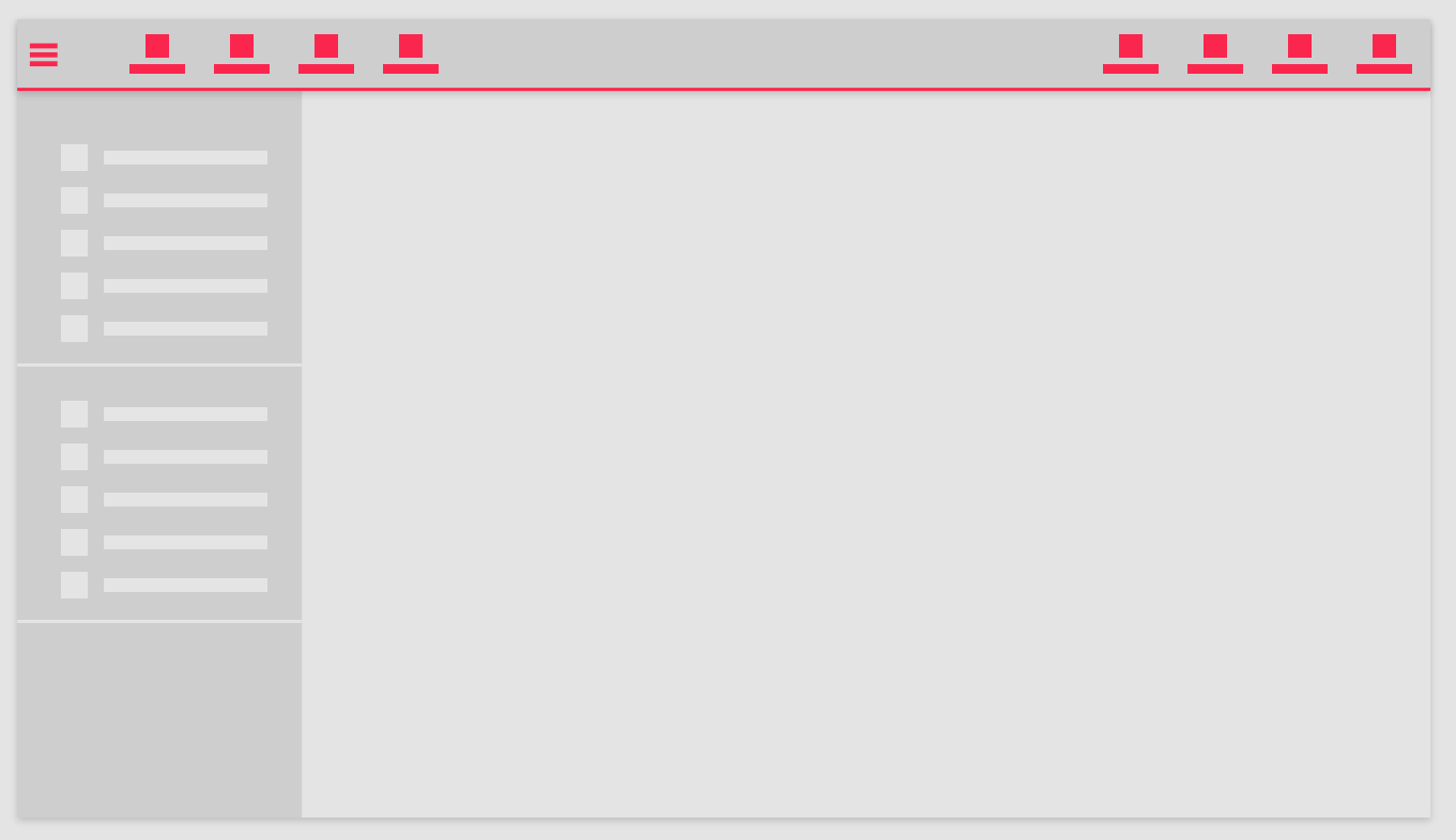 | rgba(255, 255, 255, 0.8) |
TopmenuHoverColor | Color of header element (accent line and icon) when hovered. | Color | 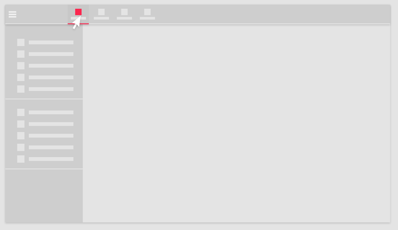 | rgba(255, 255, 255, 0.8) |
Transition | Transition effect on elements in the side-navigation menu. | Transition | Illustration not available | background .2s,color .2s |
Accepted parameter values
Highstage UI parameters make use of valid properties that belongs to CSS (Cascading Style Sheets) standards as supported values.
Through CSS syntax there are many different ways that colors, sizes, fonts and effects can be defined. For each parameter, we simply take advantage of existing CSS properties and allows you to define it's value in any way you want - in accordance with CSS standards.
Here, you will find a list of the different types of parameters that can be used to control the visual appearance of Highstage. Similarly, we introduce you to the wide range of permitted values that can be used in the different parameter types:
Colors
The Color parameters in Highstage accepts all legal color values that are available in CSS (Cascading Style Sheets) including Hexadecimal, RGB, RGBA, HSL, HSLA and predefined color names (red,green,blue etc.). Read more about available CSS colors on w3schools.
Color gradient transitions of two or more colors are also supported by the Color parameters. Read more about the available CSS gradients and syntax on w3schools.
Icons
The Icon parameters in Highstage accepts any of the icons made available by Font Awesome.
- Select any available Solid icon from the list of available icons.
- Click on the selected icon that you want to use in Highstage.
- Copy the text within the
<i> </i>field:
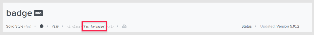
- Paste the text (ex. fas fa-badge) into the parameter value field for the appropriate Icon parameter:
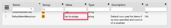
- Click Reset in the top navigation menu for the changes to take effect:
Note: In this example, we added a Badge icons to be the default icon for all links in the side navigation menu.
Sizes
The Size parameters in Highstage are the height and width properties that can be used to set the height and width of specific elements in Highstage. The Size parameters accepts all legal size values that are available in CSS (Cascading Style Sheets). Read more about available size properties and values on w3schools.
Recommendation: We recommend that you define the height and width of elements in pixels (px) for a consistent and static layout throughout Highstage.
Transition
The Transition parameter enables you to add transition effects on the elements associated with the parameter.
This, for instance, enables you to configure a delay, transition or transformation of elements when they are clicked, hovered or activated.
For instance, the following snippet results in a transition where a change of background- and text color will occur over a span of 0.3 seconds:
background .3s,color .3sRead more about the various CSS transitions on w3schools.
Duration
The Duration parameters accepts positive integer values that reflects time passed in milliseconds.
Text
The Text parameters are the font sizes that are used throughout Highstage. The Text parameters accepts all legal font size units that are available in CSS (custom Style Sheets). Read more about the various ways that font sizes can be declared on MDN web docs.
Toggle
A checkbox, allowing you to enable (✔️) or disable (❌) a parameter.
Weight
The Weight parameters sets how bold or thin characters in text elements in Highstage should be displayed. Read more about the various ways that Weight can be defined on w3schools.
Shadow
A shadow parameter sets a shadow on an existing element. Read more about how shadows can be defined on MDN web docs.
Default UI
The combined list of default parameters from the available parameters will result in the following appearance of Highstage:
Quick customizations
Some instructions to get you started with basic UI customizations.
Changing the primary color
To change the primary used color of Highstage, you can set the Color of the DialogHeaderBGColor, SidemenuBGColor and TopmenuBGColor parameter to any single preferred color for a consistent look:
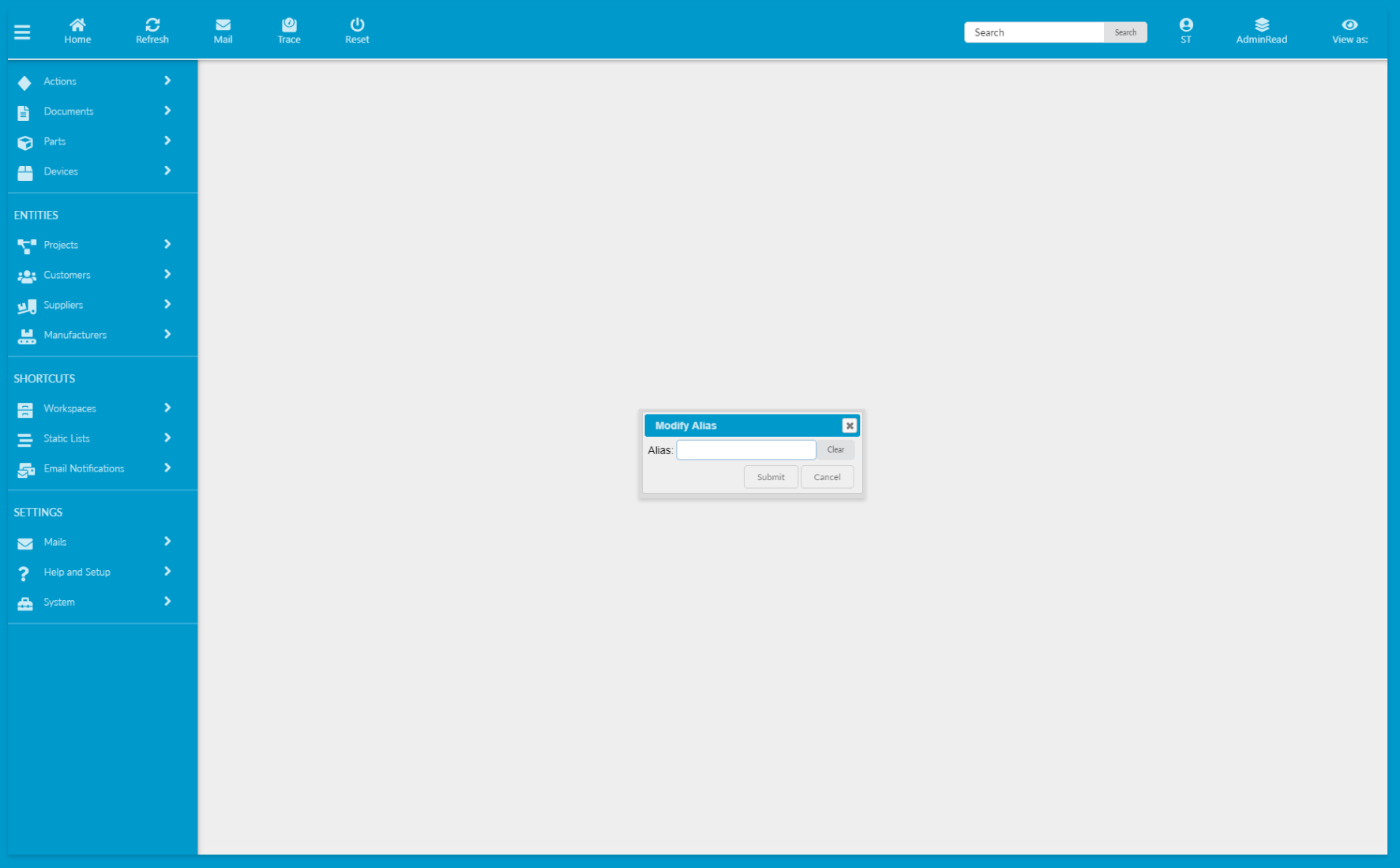
In this example, we have set DialogHeaderBGColor, SidemenuBGColor and TopmenuBGColor to the hex value of #0099cc.